Farmhouse-inspired design has become wildly popular among homeowners, and for a good reason – the style exudes the type of coziness and warmth you want when you walk into your home at the end of a long day. And, while many have transformed their spaces with the rustic-chic style in mind, you’re not sure where to begin.

Fortunately, there’s one easy place to start, and that’s with the paint color you’ll brush onto your walls. Modern farmhouse design typically incorporates soft tones, especially in these five foolproof shades.

1. Alabaster
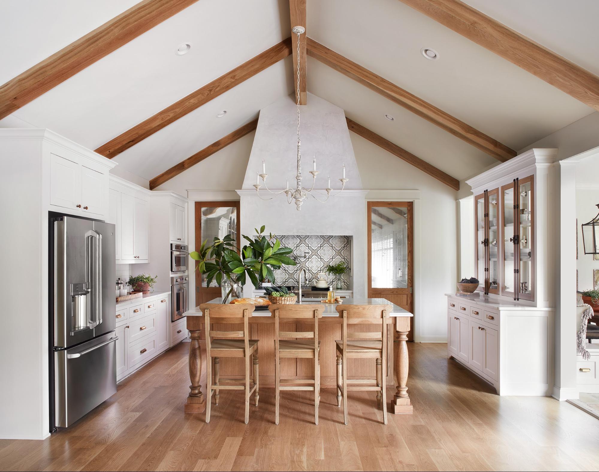
The right white for your farmhouse must be somewhere between a warm and cold undertone. The former will become too yellow, thus pushing your farmhouse-inspired style into the realm of country. Meanwhile, a bluish-white will feel too cold and stark, which is precisely the opposite of what the farmhouse style aims to accomplish.
So, slightly warm but mostly neutral alabaster is the perfect shade to consider if you want white walls in your abode. Even if you’re going to use a more pigmented paint, consider alabaster for your crown molding, baseboards, doors, etc. Oh, and of course, it is the perfect color for your shiplap wall, should you choose to install one in your modern farmhouse.

Oh so warm and inviting!
2. Greige
Here’s another farmhouse classic, and one that’s between two traditional neutrals, to boot. Greige meets in the middle of gray and beige, so it’s slightly warmer than a regular gray without becoming a dull, builder-grade khaki color.
An additional benefit to choosing a gray-infused neutral is that it’s a super-popular color choice these days. On top of that, the right gray will work in just about any space. Your kitchen, bathroom, living room and even your master bedroom will look great in shades of gray to greige.

Such an amazing color that blends seamlessly with any Home Decor Style
3. Light Gray
Another option from the same family is a pure gray, just one that’s a little bit lighter on the color spectrum. A gray that’s too saturated can feel too cool or stark for your farmhouse-inspired space. If you can’t find the right shade at your local hardware store, ask for a custom blend. Have the technician cut the darker gray with white until it achieves the light-but-not-too-light shade of gray you’re looking for.
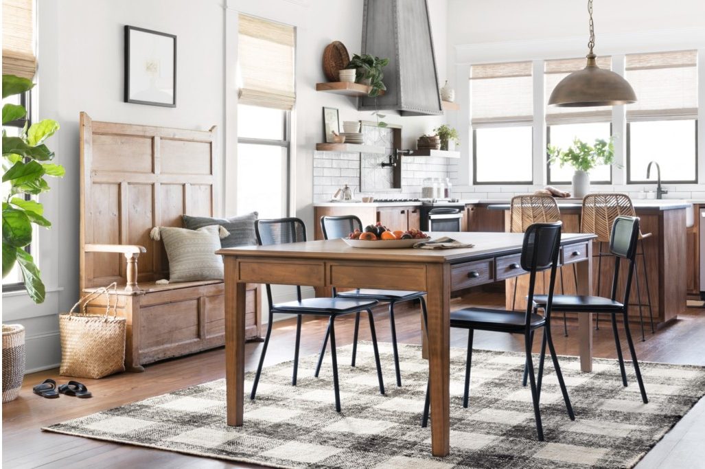
Joanna Gaines uses a soft light grey that is simply dreamy.
4. Green-Blue
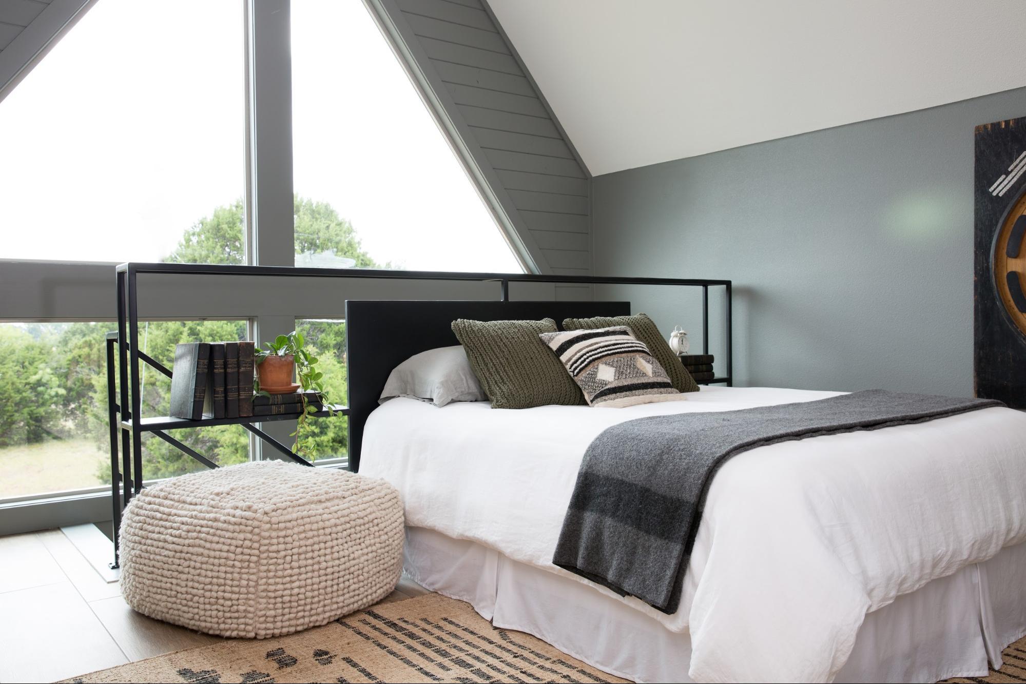
If a neutral backdrop doesn’t suit your style, you’re in luck — there’s the classic blue-green hue to fall back on, and you can use it in just about any room of your home.

Joanna Gaines uses a lightly green and blue paint for this Nautical Room
A soft green-blue graces your farmhouse with the perfect amount of color, and many blends will give your space an ever-changing appearance. For instance, you will notice moments in natural light when the walls appear to be a brighter or different shade than the one you painted onto the walls. From others who have chosen this color for their farmhouses, we hear this is one of the best parts of a blue-green space.

Another option is to go with a shade that’s bluer or greener for a bit more variety in your farmhouse. Although you should always choose a soft shade — farmhouses tend to come with muted tones — you can slide up and down the blue-green spectrum to find your right blend of colors.


5. Light Anything Else
The above four shades are undoubtedly the most popular options for a farmhouse-inspired abode. However, you might envision another shade for your place, whether it’s a soft pink for a nursery or a creamy yellowy-white for your foyer.

This light pink plaster is pretty amazing!
You can make all these shades work in your farmhouse, so long as they are light. An intensely pigmented color won’t work on your walls, at least as far as the modern farmhouse goes. So, don’t be shy to paint on an extra-light version of your favorite hue, even if it’s not on this list. By reducing the amount of pigment, you’ll make the shade as much of a farmhouse color as it could ever be.
Make Sure It’s Perfect
Now that you have the top five farmhouse-ready hues in mind, it’s time to go shopping for the right gallon of paint. Don’t buy a color based on the paint chip alone, though — you’ll want to bring samples home to make sure you choose the right option from all your potential hues.

Brush a bit of each paint option onto your wall, let them dry, then observe. You might find the color you thought was perfect beneath the hardware store’s fluorescent lights is too blah for your home. Alternatively, a light shade might be overly pigmented if your home doesn’t get much natural light. Buy more samples and test them as well to be sure you’ve landed on the right color.
Most importantly of all, though, you have to love the color you choose. Even if it’s not on the above list of options, all that matters is that it’s the right shade for your version of the farmhouse. So, grab a roller and get to painting — you have a cozy abode to create with that can of paint you just bought.
What color do you favor???
Come Check Out The Farmhouse Gallery
Stay Up to Date with The Cottage Market by Joining our Mailing List!
Follow Kacey on Twitter and subscribe to her blog to keep up with her travels and inspiring posts!
| Want to stay in the know? I’d really love that! (((HUGS))) |
| Like … on Facebook | Follow … on Pinterest | Follow … on Instagram | |
 |


Oh I love these colors! I purchased a Benjamin Moore light grey ( HGTV color name I cannot remember at the moment ). for my upstairs rooms which are the kids rooms and all the trim white. It literally seems to go with any theme I have seen ( one wants blue pastel, pineapple
Geo shapes..other one a pink or peach with unicorns etc.. ) and I did not want to repeat the painting process everytime the girls or I wanted a change lol, and girls are always changing there minds especially a teen & pre-teen. Our downstairs is farmhouse theme, at one point I would like to repaint the downstairs walls, cabinets & maybe the wood trims. We have a lot of
stained wood – hard Wood floors, trim – windows + baseboard, stairs, handrail, kitchen cabinets, interior and exterior doors ( only inside part on our exterior doors – outside is burgundy ), everything in a orangish oak 70’s color, with a light greenish beige color walls. Its all the original part of the house we were told. The wall color has to go though & color of kitchen cabinets haha. I’m hesitant with painting or staining the trim I read it’s hard to remove or cover existing. I’m off topic but of these paint colors which I do love and think it will always be a good idea for neutral color choice for people like me who don’t want to repaint every year or have to replace it. I have been a subscriber for awhile now, Thanks for everything, from the ideas, to the printables & recipes. Have a great day.
*Danyelle P.
Hi there Jacqueline … how are you! So happy you enjoyed the Paint Color Post : ) It sounds like you are a PRO PAINTER lol!!! Sounds like the girls are true tweens… always changing things up … but you are SOOOOOOOO right… white trim goes with EVERYTHING and you are also right… who wants to repaint it every year lol!!! I love that you have tons of wood going on in the home… it’s so warm and inviting! Neutral colors are great for many people and highly recommended… I am stepping away from them this year in my studio which I am painting a turquoise with white trim. I am so happy that you enjoy the ideas… diys… printable and recipes… that makes my heart happy : ) Thank you for filling me in on your home… I LOVE LOVE LOVE hearing about it!!! Here’s wishing you and yours the most wonderful Holiday Season EVER and thank you so much for dropping by… I will be looking for an update soon : ) Tons of HUGS!!!